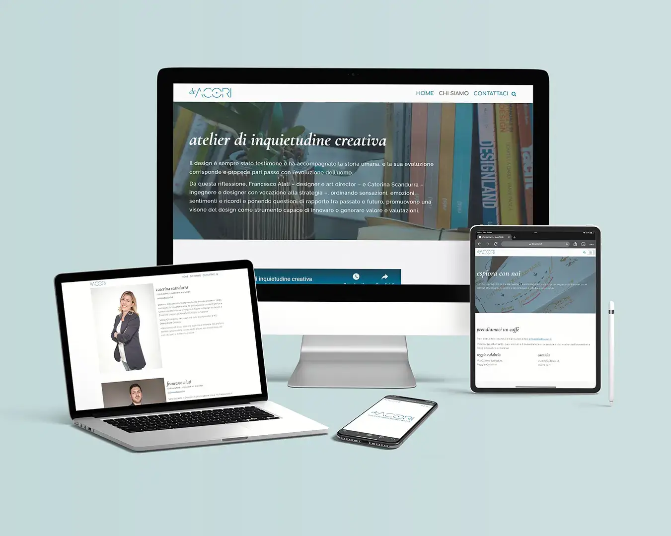
Brief
Strategic design studio deACORI, atelier di inquietudine creativa (atelier of creative restlessness), promotes design as a custodian of actions, behaviors, and rituals (Azioni, Comportamenti e Rituali, hence the acronym ACoRi).
The studio’s need is to communicate a multiform identity that embraces actions, creates harmony in the individual and in the community, and denotes a mood that changes over time in different places of living.

Concept
According to the deACORI studio, design has always witnessed and accompanied human history, and its evolution corresponds and goes hand in hand with human evolution.
From these premises, during the study of branding, the concepts of:
— inhabiting/exploring different spaces;
— human centrality;
— curiosity;
— restlessness;
— dynamism;
— evolution.

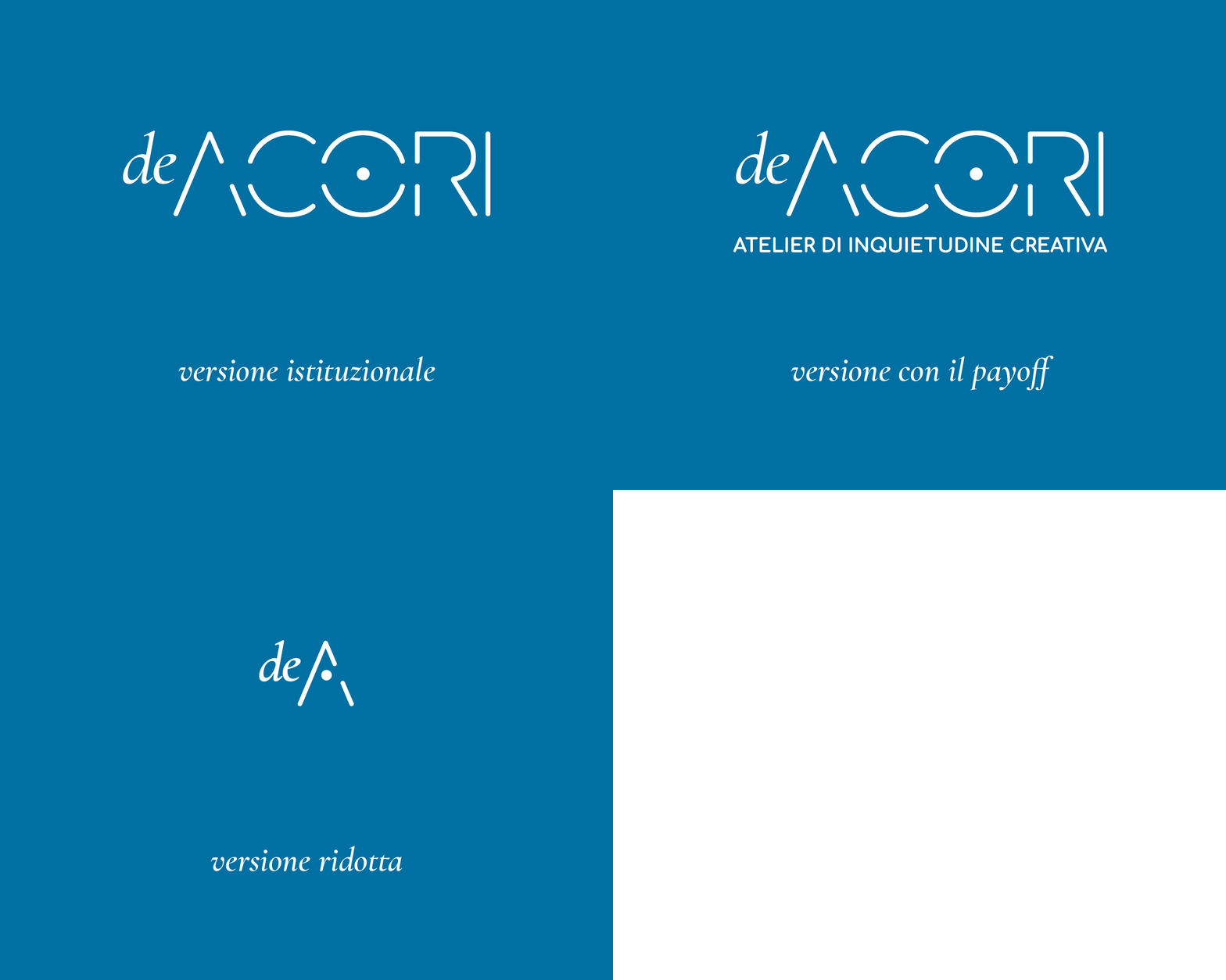
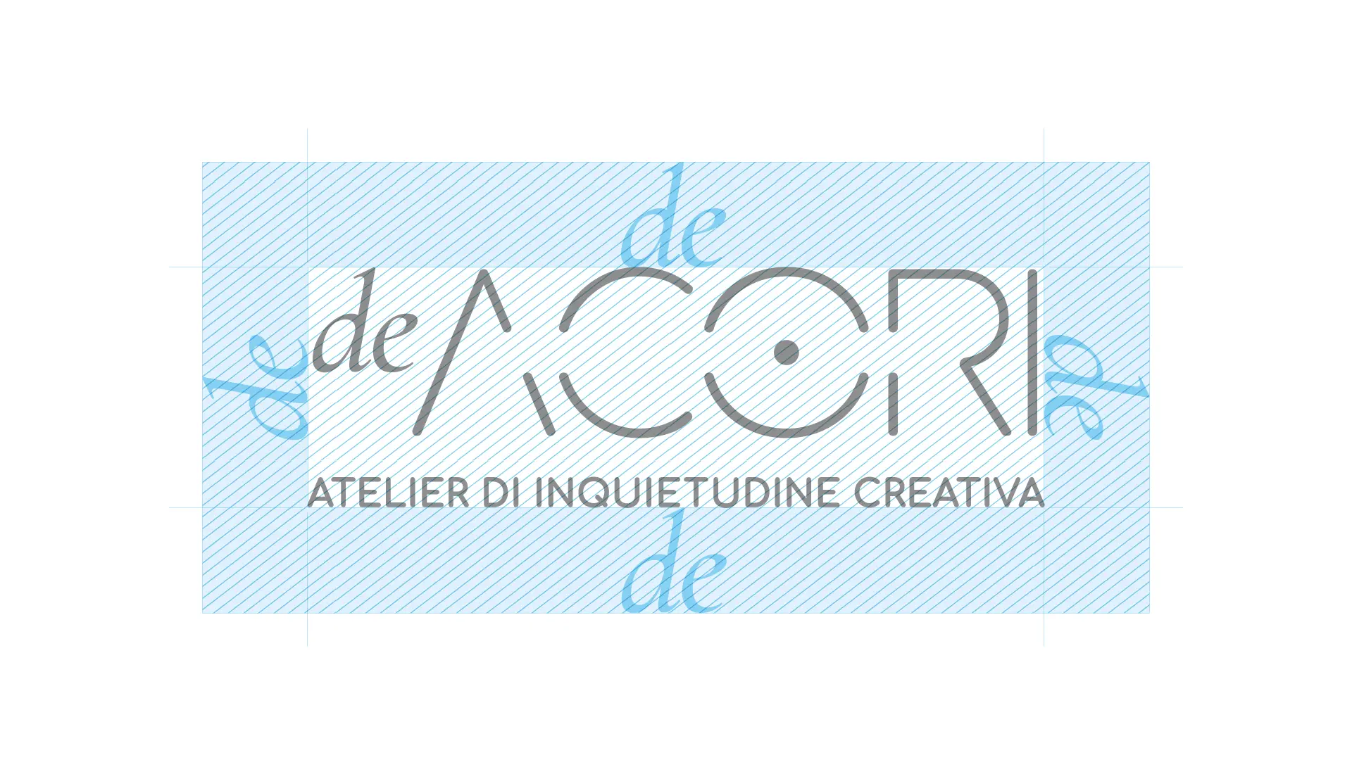
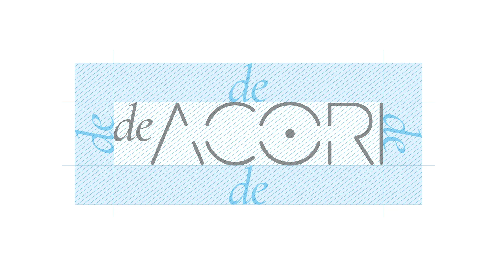
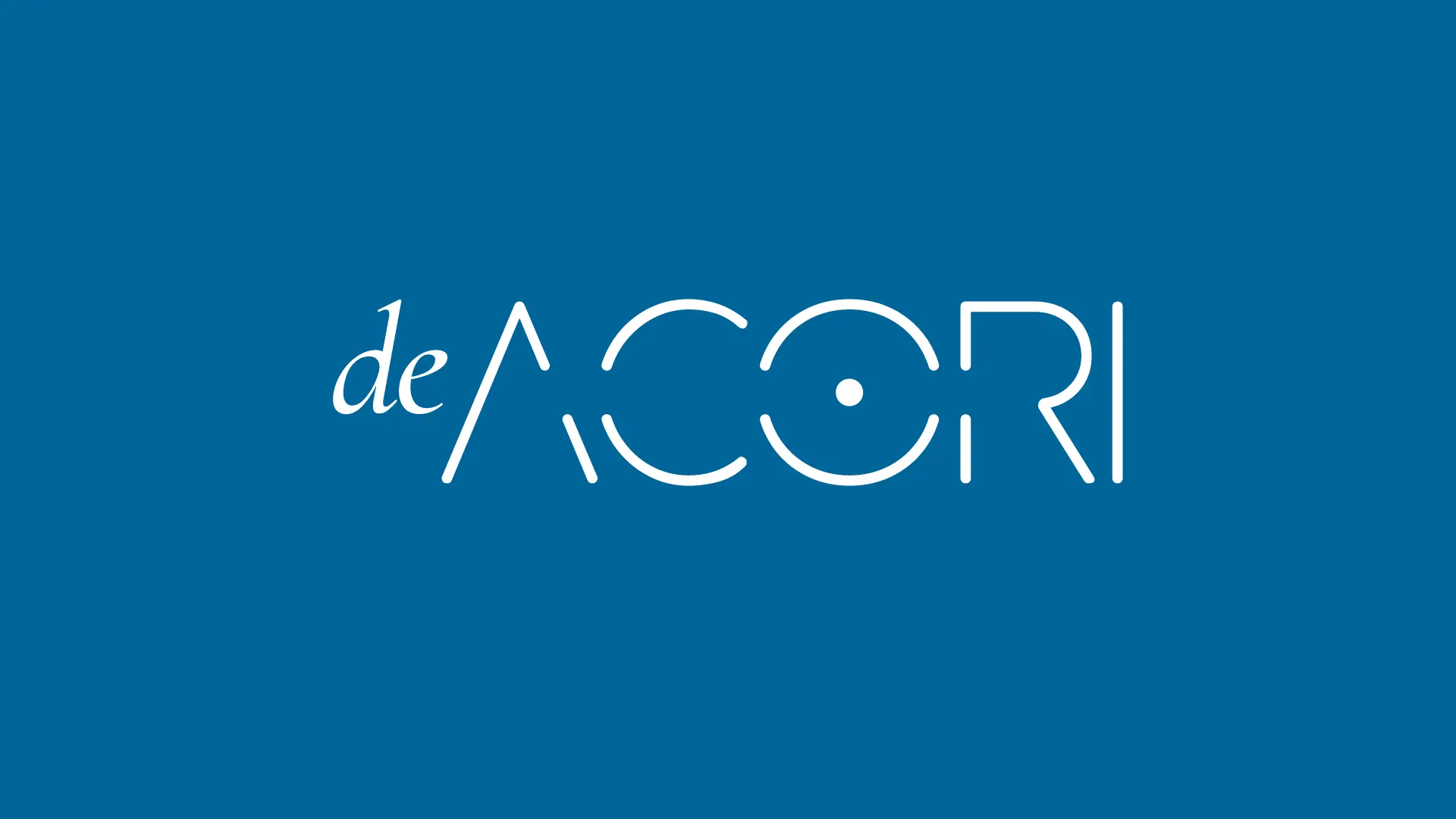
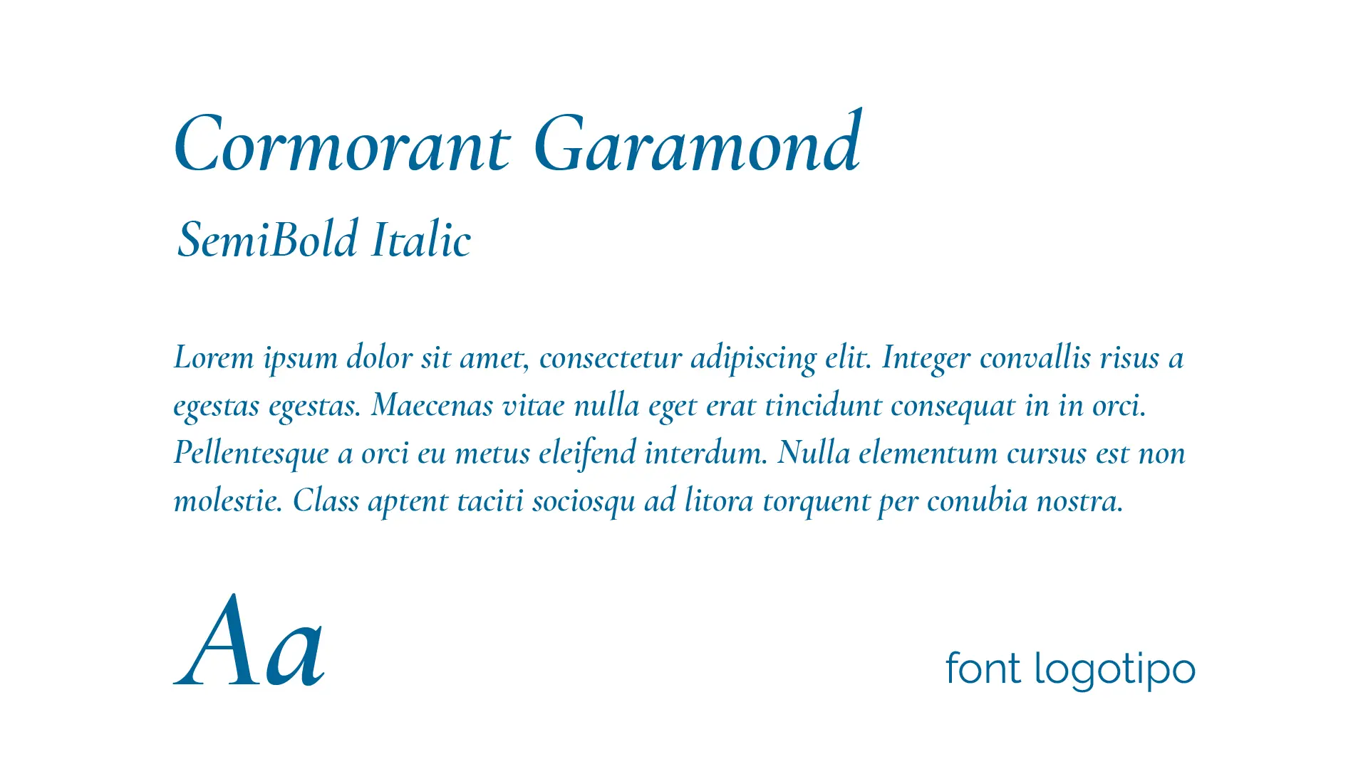
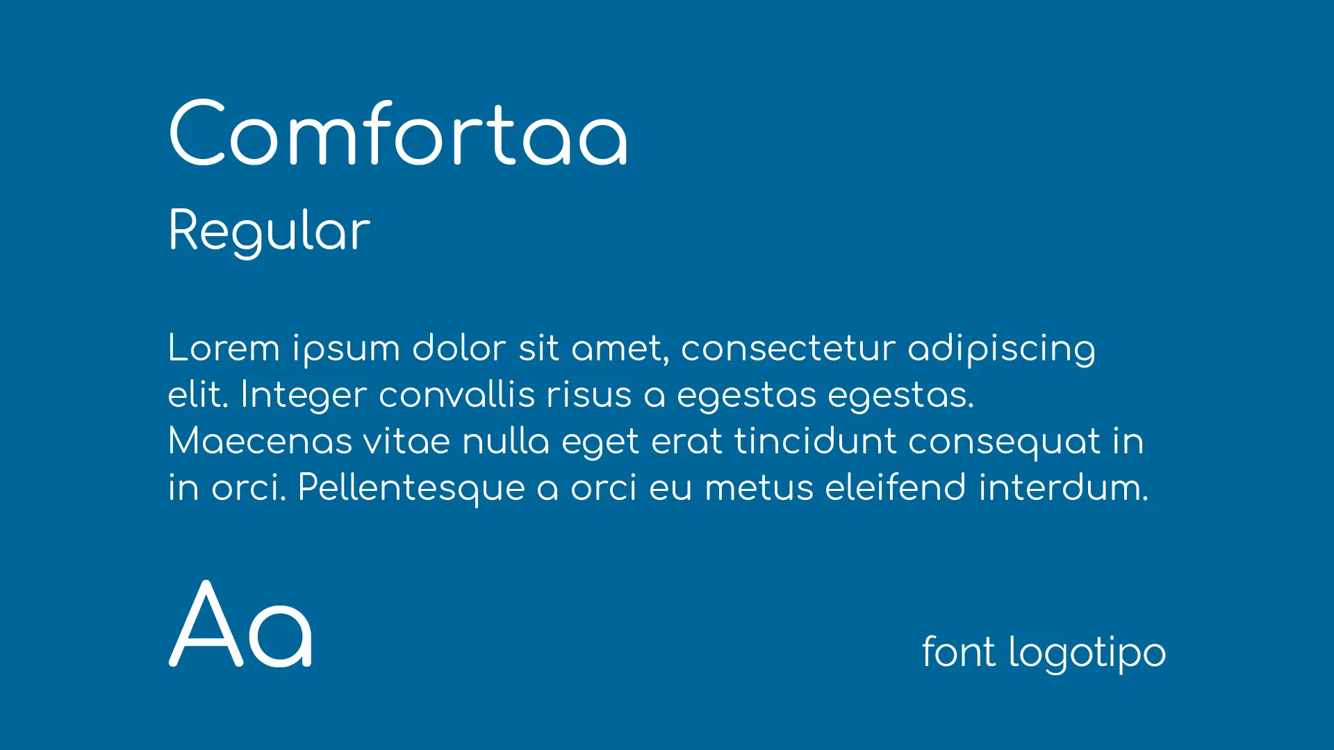
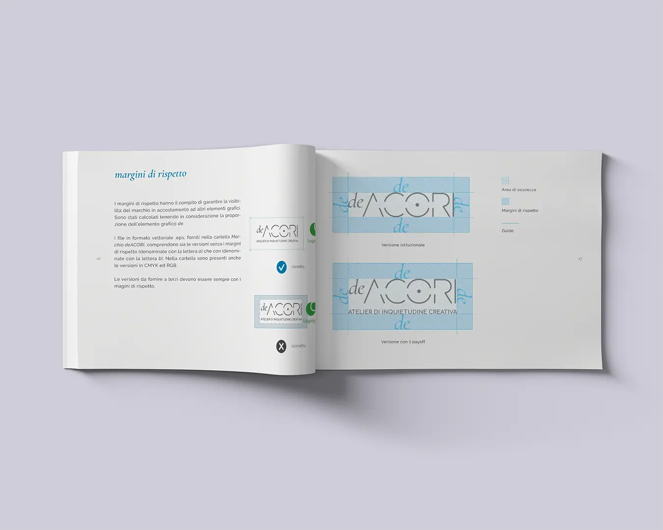
From these reflections the logotype of deACORI was designed, a symbiosis between a traditional (serif) font, Cormorant Garamond, and a modern (sans serif) display, Comfortaa. To ensure a better balance of the two-character composition, composition by golden proportion was used.
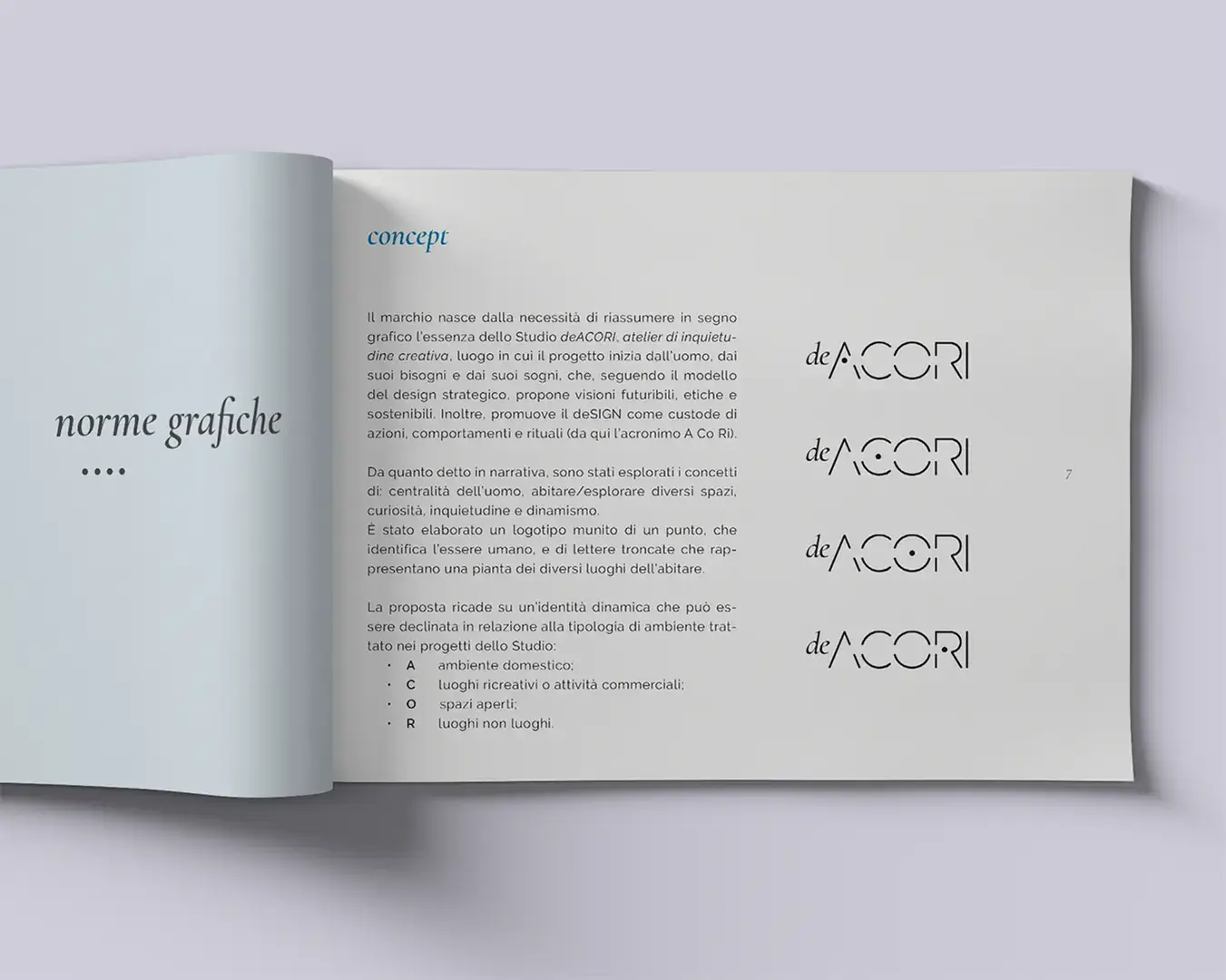
The logotype is associated with a dot, which identifies the human being, and of truncated letters, which represent the layout of different places of living.
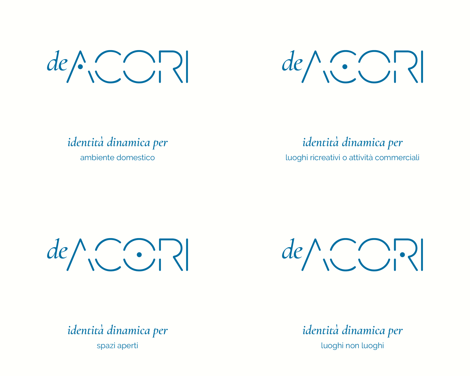
In relation to the type of environment covered in the firm’s projects, the logotype dot takes different positions, giving rise to a dynamic visual identity for all intents and purposes:
— A domestic environment;
— C recreational places or commercial activities;
— O open spaces;
— R places non-places.
